


Dyno charts are not the gospel of power. Far from it! Even if everything to do with the runs you pay for in a so-called dyno “tune” is dead-nuts accurate and the operator isn’t in the habit of using certain tricks of the trade to “fudge” the results in order to look like a tuning “wizard,” the first problem is that all you get for proof is a piece of paper! On that paper are certain “standard” bits of information—torque arc, horsepower arc (hopefully corrected and “smoothed”)—plotted against a graph that shows power numbers in the vertical axis and RPM in the horizontal axis. More importantly, there’s supposed to be an air/fuel line in a box of its own below the main graph. Of all the information on this slender sheet, the A/F is the most useful, if for no other reason than it tells you a great deal about how close to (or far from) “optimal” power you are, using your particular selection of go-fast goodies. A/F ratios that “plot” like a ruler’s edge along the bottom of the page indicate that you got all the power you paid for. Those that look more like a snake say you didn’t! Either way, the rest of the info on the graph isn’t exactly etchings in stone, unless it’s the Rosetta stone!
For those who’ve forgotten their history, the Rosetta Stone is an ancient stone with the same text carved on it using three scripts (hieroglyphic, Demotic and Greek) that was the key to translating previously unreadable hieroglyphics. Accurately translated dyno charts (as we are hopefully about to discover) are pretty much the same notion. You need to look at all three variations of the “scripts” available from a dyno to understand the language of performance. And believe me, they don’t all say the same thing about peak numbers! Looking too closely at those alone is like studying hieroglyphics without a Rosetta Stone! Soooo… (if just to say we tried) let’s look at what can be (but too often isn’t) found within the “scripts” of a dyno chart and take a crack at interpreting the meanings—OK?
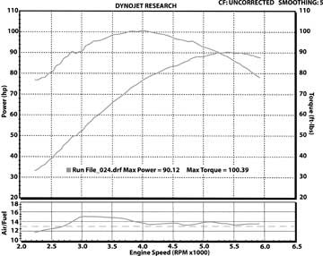
Here’s the popular “normal” form of the dyno chart. In fact, this version is the one we seem to seek out most often for proof that our performance dollar has been well spent. But what, in fact, does it really tell us? For one, that by most reckonings this is a healthy horse, with over 90 lbs/ft. of torque from 3000–5000 rpm and a nice, textbook “shark fin” shape to the horsepower curve, peaking at roughly 90 whp at a little over 5000 rpm. Yet, in spite of those pretty curves, the uneven air/fuel line reveals that there’s more to be had. OK then—noting the precision EFI offers, do you suspect the problem is the cam choice or the exhaust pipe… or could it be something else entirely?
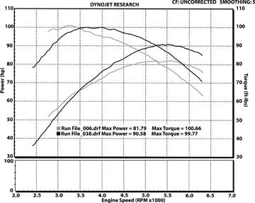
Two different motorcycles, but with very similar numbers, compared with one another. It’s obvious that one makes its peak numbers at lower RPM and those numbers are lower in general. The machine with those lower numbers, by normal reckoning, has at least two problems compared to the stronger one. First, it just plain makes less. Secondly, it “chokes” as revs build. All the same there’s at least one “hidden” advantage, in that what there is occurs early in the rev range.
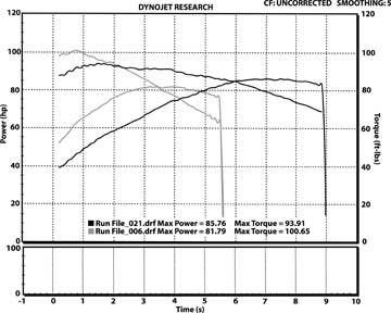
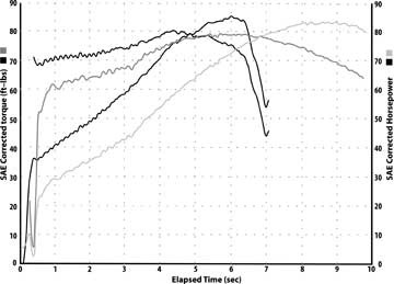
But wait—there’s more! Look at this! This time the graph is against time rather than RPM and tells a quite different story. Talk about getting into the power in a hurry! The low-powered bike makes the most torque at the lowest engine speed and gets to it in less time than the “high” powered bike! More importantly, it will hit its rev limit in five and half seconds, whereas the high-powered bike takes a full nine seconds to do the same. The higher-powered machine gives it up very s-l-o-w-l-y! (Perhaps a result of a total mismatch of exhaust system to the rest of the system?) These simple facts, most often not shown on the typical dyno chart, affect the way the respective machines operate on the streets more than you know!
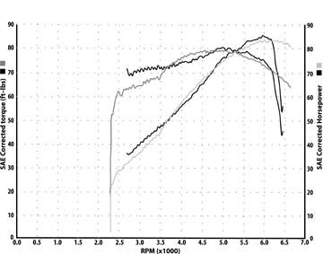
For some unknown reason, newer Windows-based Dynojet software doesn’t offer a certain “feature” that the older DOS software does. That’s why this example, comparing two XL1200 Sportsters, is a “screenshot” of older, but still valid dyno runs. Though not “prettified” with smoothing and stretching and other visual benefits available in the newer views—this older “view” is charted in the ordinary fashion, against RPM. All in all, it would seem there’s damn little to choose between the torque and power curves of these XLs—wouldn’t it?
Well, look at it this way—here we see “graphically” that one of the Sportsters, due to pipe choice, or cam choice, or something along those lines—can get to and through its torque and power much more rapidly than the other…
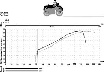
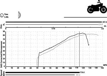
Which leads to this. Essentially, a simulation of what would happen if these two machines—with very similar power bands, but very different “access” times—were to goose it side-by-side on the road at 53 mph. Yeah, they start dead even—same weight, same gearing, same engines—real apples to apples stuff.
On-screen, with the old software, this simulation runs kinda like a video game. Since that’s not feasible for these printed pages, we’ll stop the action at roughly 70 mph, to show you what happens to two bikes with the same power, once the one that can get to that power quicker shows its stuff. You can see, graphed against road speed this time, that there’s half a bike length in “real” performance difference.<
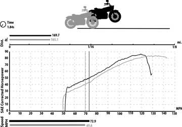
Less than four seconds into this adventure, another “stop action” pic shows clearly that power subtleties which aren’t apparent on a regular dyno chart are all too apparent in a roll-on to 90 mph! A 4 mph, three-bike-length performance advantage is awfully hard to ignore!
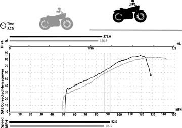
Smokin’ past 100 mph, the gap just gets ridiculous! Forty-three feet and 7 mph should prove that the time it takes to get two comparable machines moving is more indicative of street performance capabilities than mere power curves at various engine speeds—as usually presented on charts. (I suppose this is one reason lots of old-school tuners maintain that the drag strip is still the ultimate dyno, since unlike a dyno cell, nothing is obfuscated or obtuse on a track.) Now—extrapolate a little regarding what we’ve just shown with these old charts, against what you might (now) expect, based on the “new” chart (pic #3) of two Twinkie Big Twins and their relative times to get to their respective power. Wanna make any heavy bets on which will actually be quicker and more power-friendly on the road? You simply can’t believe everything you see on a dyno chart (unless you’ve seen everything that can be charted). Hell, even the whole story might not tell ya the whole truth.


")


